It was founded by two estheticians with over 28 years of experience in Los Angeles, California.
Established a loyal customer base through word-of-mouth and personal interactions.
Recognized the need for an online presence to remain relevant and attract new customers.


Business Background
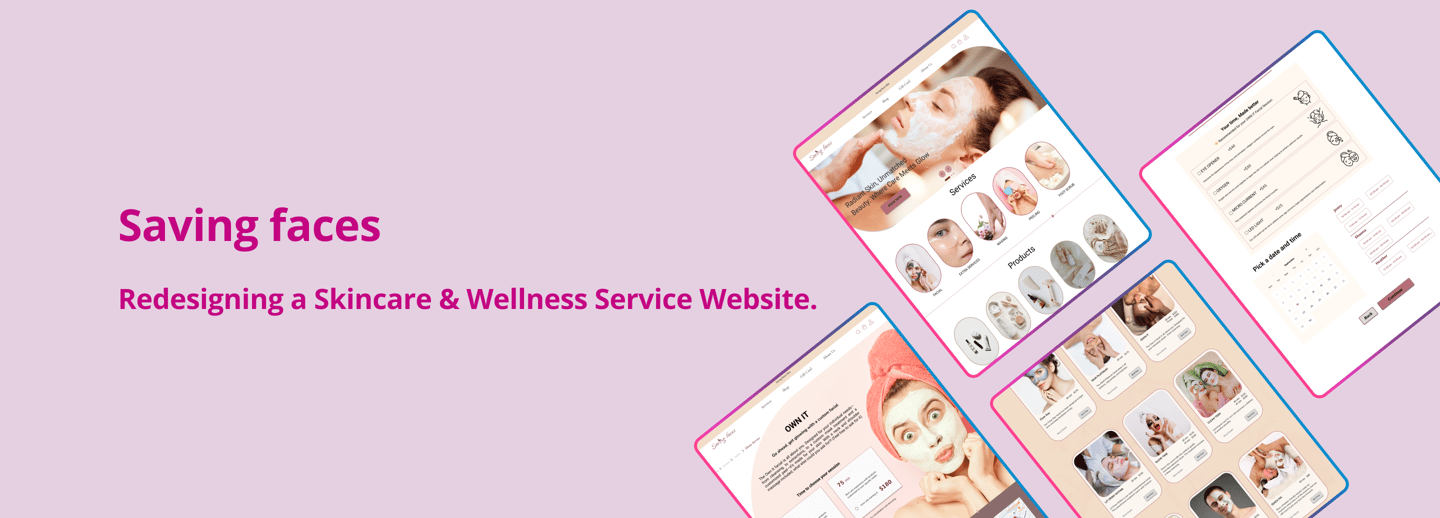
Project Overview

Problem Statement
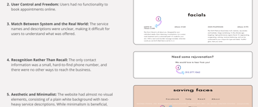
The business specifically asked for a solution to reduce the high volume of calls caused by users struggling to understand and book services online.
They requested a website that presents all services in a clear and user-friendly way.
They also gave us the flexibility to refine and rename services that users found confusing.
Goals
Enhance service visibility and modernize design to improve the overall user experience and encourage more online bookings.
Refine information architecture for more intuitive navigation.
Streamline the booking process to create a seamless, user-friendly interaction.
This project was part of a boot camp training program. As a practical exercise, we were required to redesign a website, enhancing our UX design skills.
Design Process
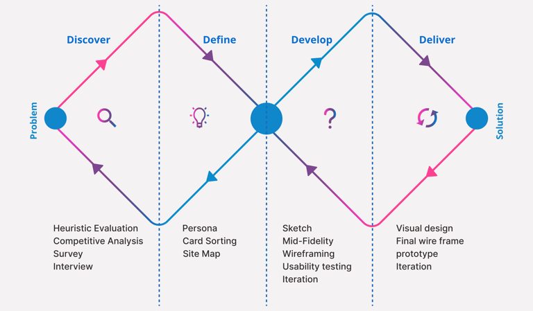
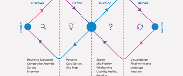
Double Dimond
My teammate and I adopted the Double Diamond methodology to structure our design process. This allowed us to navigate from research to implementation systematically and user-centered.
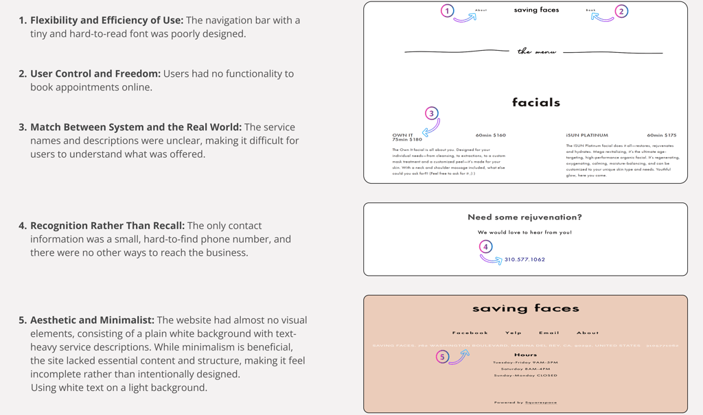
Heuristic Evaluation
Competitive Analysis
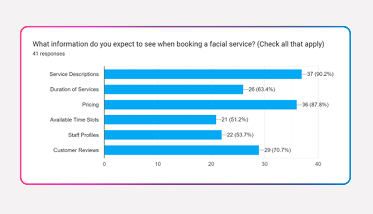
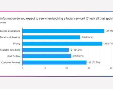
A survey was conducted with 41 participants, of whom 63% were between the ages of 31 and 40.
The participants identified the following as the most important types of information they expected to find on a skincare website, ranked in order of priority:
1. Service description
2. Pricing
3. Customer reviews
Survey
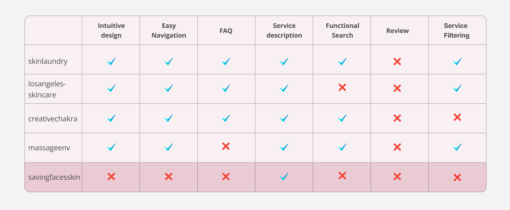
After uncovering usability issues through a heuristic evaluation, we conducted a competitive analysis to understand how competitors addressed these challenges on their websites. We reviewed several skincare service websites, focusing on the following key features:
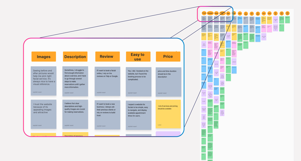
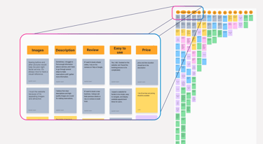
Interview & Affinity Diagram
After conducting user interviews with eight participants, both in-person and online, we discovered that the following aspects were essential for all participants:
Images: A clean design and quality images help users feel confident and trust in the business.
Description: Clear explanations guide users in choosing the right service.
Reviews: Customer reviews are essential for decision-making.
Ease of use: Users prefer a simple, intuitive browsing experience.
Pricing: Clear and visible prices build transparency and trust.
Participants consistently emphasized the importance of these elements, as they play a significant role in creating a seamless and trustworthy user experience.
Designing an intuitive information architecture so users can find what they need quickly.
Streamlining the booking process and reducing unnecessary steps to make booking quicker and smoother.
Providing clear and accurate service information
Using visuals to enhance content engagement
Ways to Enhance the Experience:
Takeaway:
By analyzing competitor websites, we learned how to create a more user-friendly booking flow by simplifying steps and using clear progress indicators. We also gained insights into organizing content more effectively through better visual hierarchy and grouping, which helped shape our information architecture.
Define
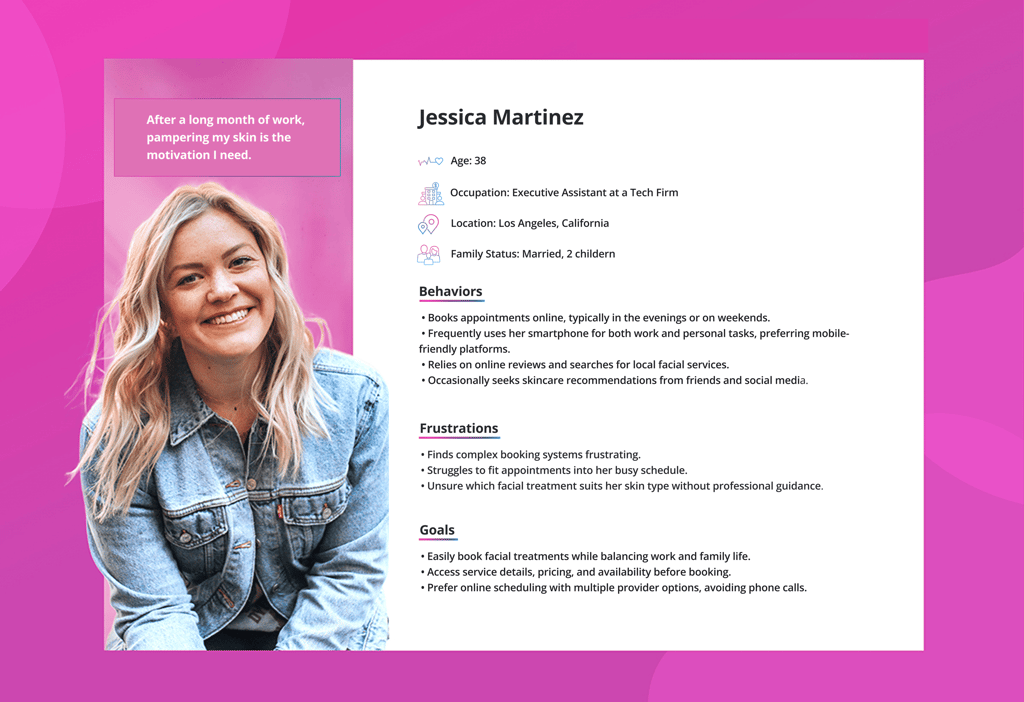
Persona
The created persona is derived from comprehensive research, including interviews, surveys, and data analysis, ensuring an accurate and insightful representation of our target audience.
Card Sorting
Method: Open Card Sorting
Number of Participants: 9
Session Type: In-person and online
Tool Used: Maze & Figjam
Process: Each participant was given a set of content categories and asked to group them in a way that made the most sense to them.
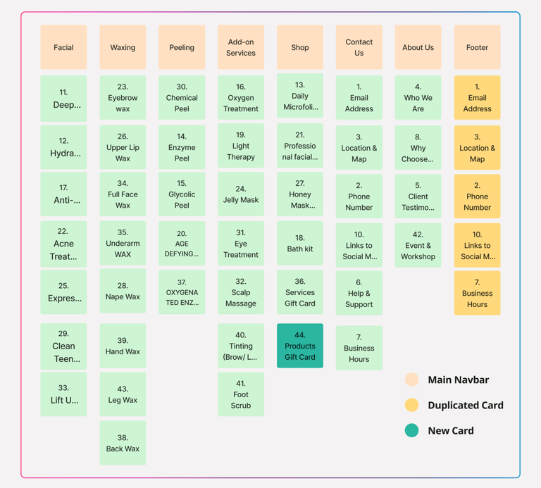
Site Map
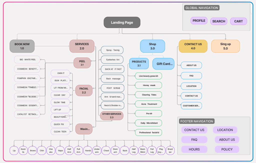
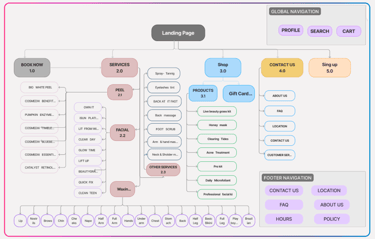
Based on the card sorting results and our competitive analysis, we designed the site map to ensure a clear and user-friendly structure, optimizing navigation and content organization.
The open card sorting session revealed how users naturally group and label our services. For example, many participants placed facials and peels in the same category, while add-on treatments were often separated. This insight helped me restructure the navigation and service categorization to better align with users’ mental models.
Takeaway from Card sorting
Develop
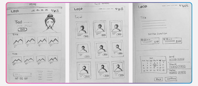
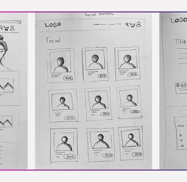
Sketch
I began my design process with paper and pencil sketches, which helped me explore initial ideas and establish a clear direction before moving to digital tools.
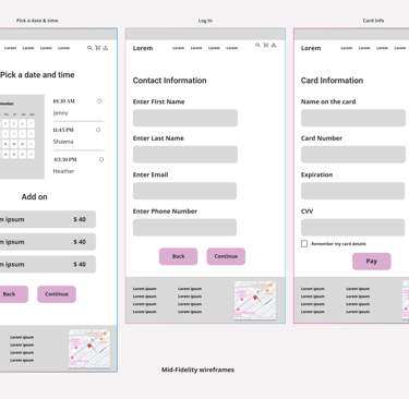
Mid-Fidelity wireframes
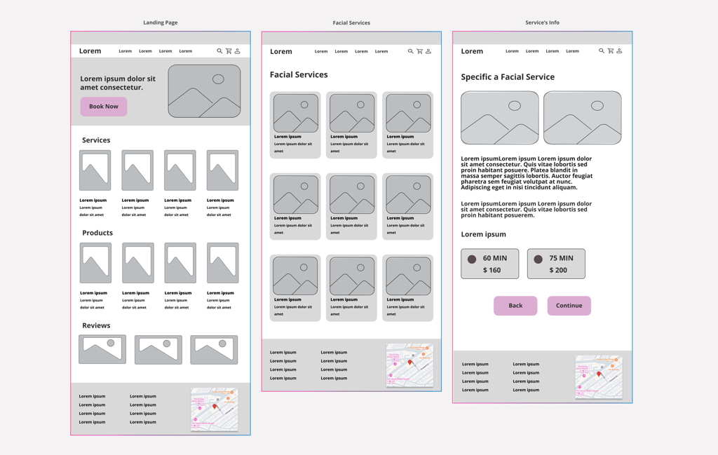
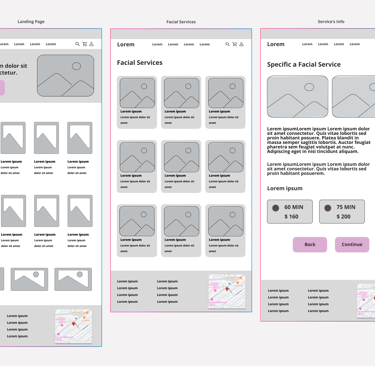
At this stage, we transformed our low-fidelity wireframes into more refined mid-fidelity versions to better define the platform's structure and interactions. We aimed to create a clearer user flow and identify potential usability issues before moving on to high-fidelity designs.
These mid-fidelity wireframes helped us validate our design decisions before refining them in the high-fidelity stage.
Usability Testing & Iteration
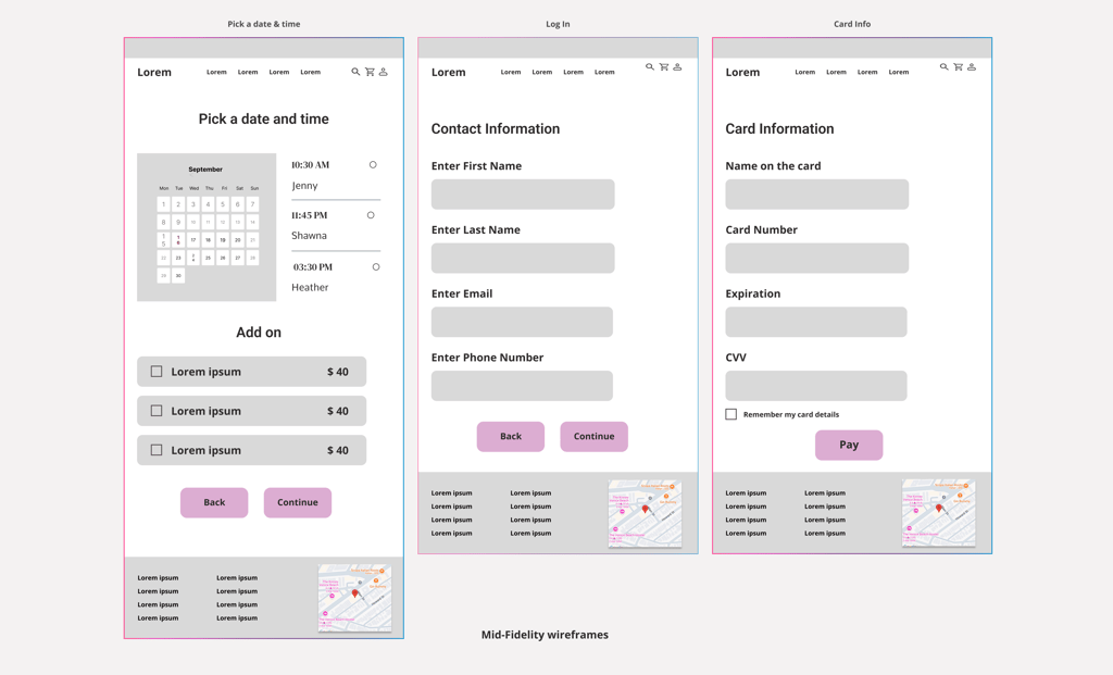
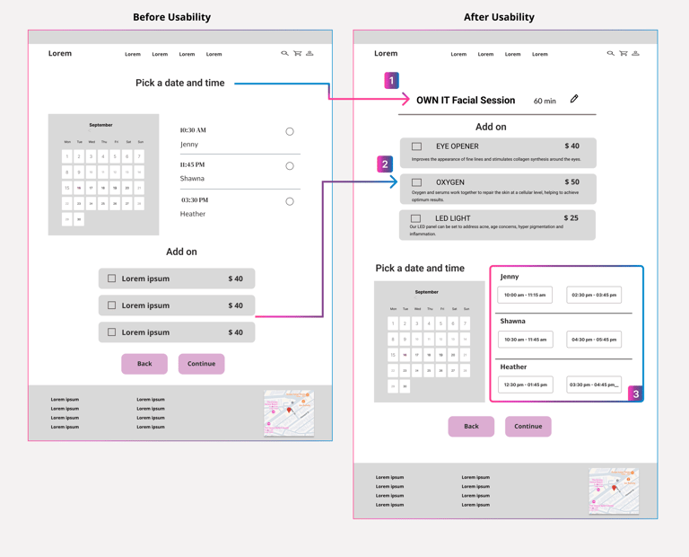
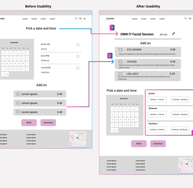
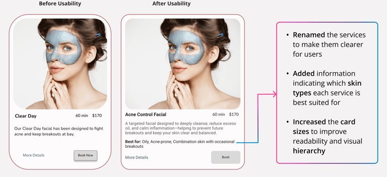
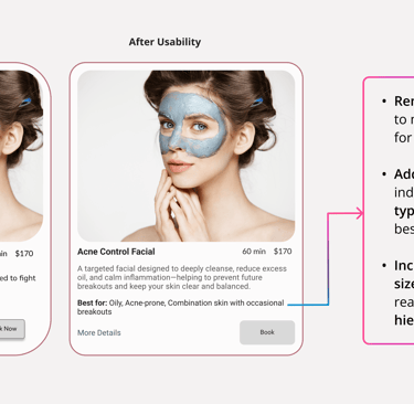
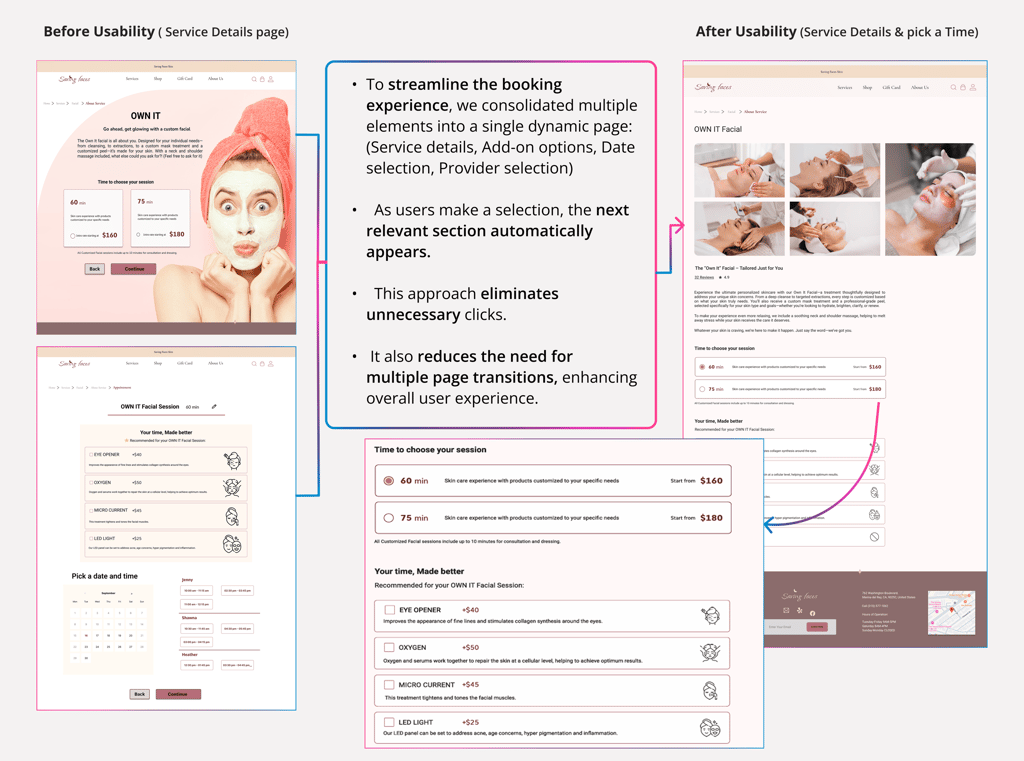
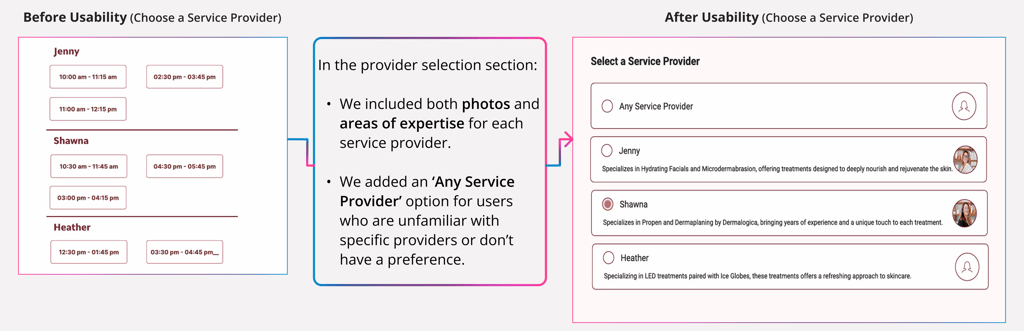
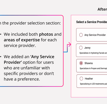
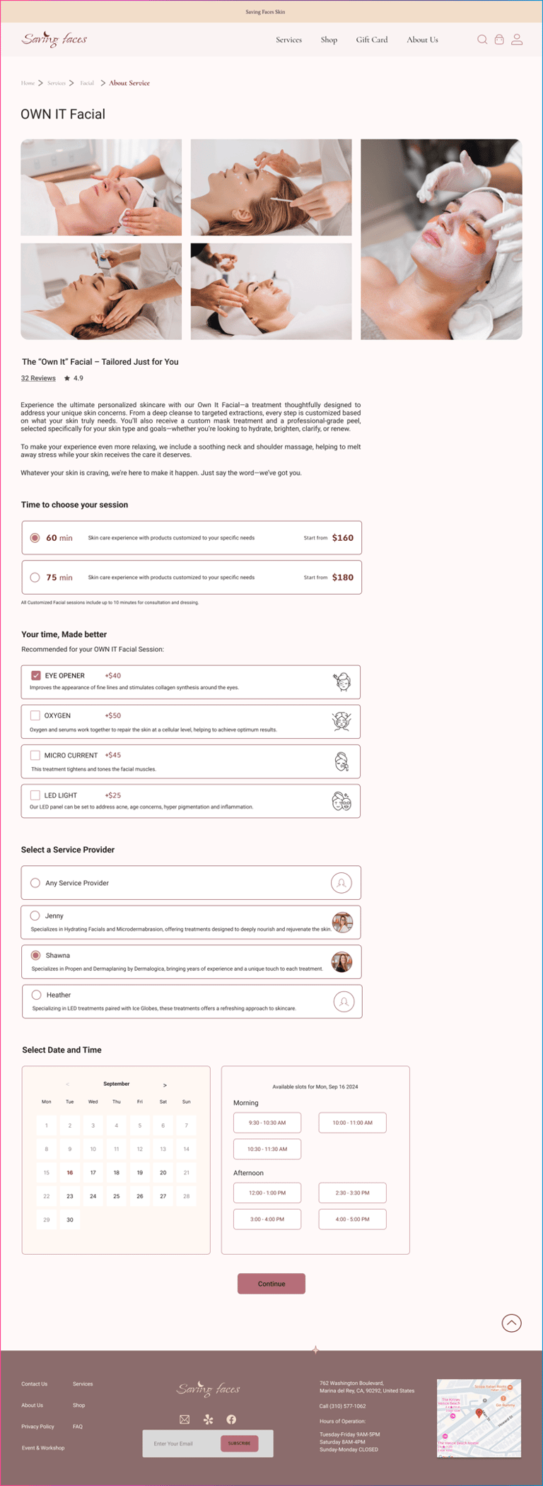
refined the flow so that after choosing a preferred date, users can now easily view the available time slots for each operator on that specific day and select the one that best fits their needs.
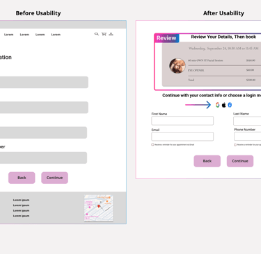
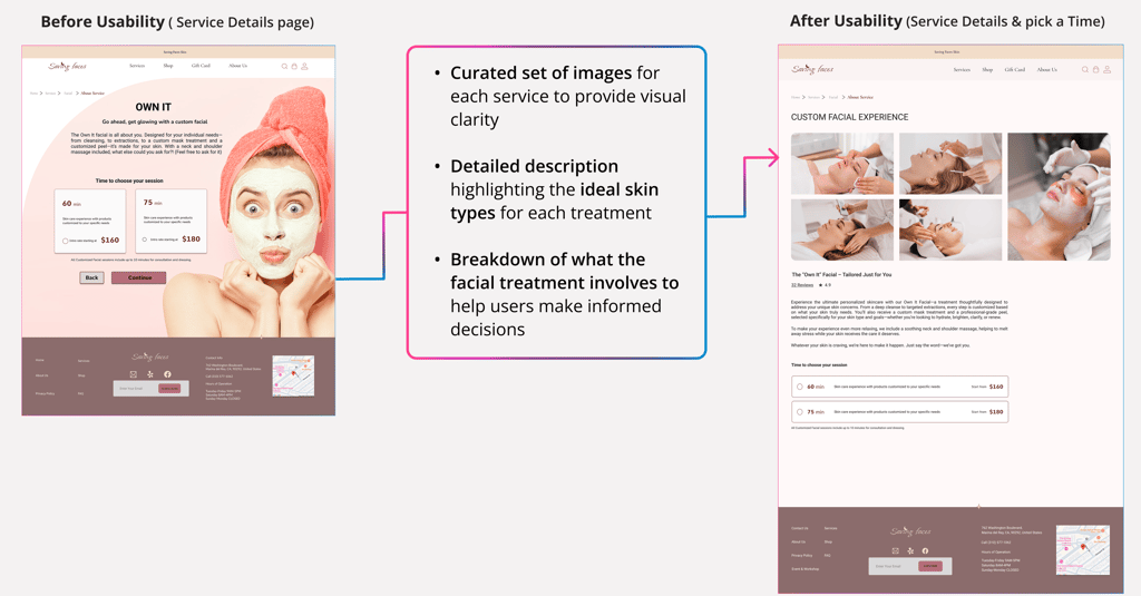
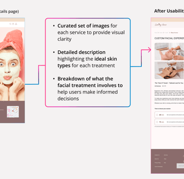
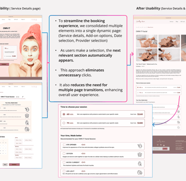
relocated the Add-on section to the top and added detailed descriptions to improve visibility and clarity.
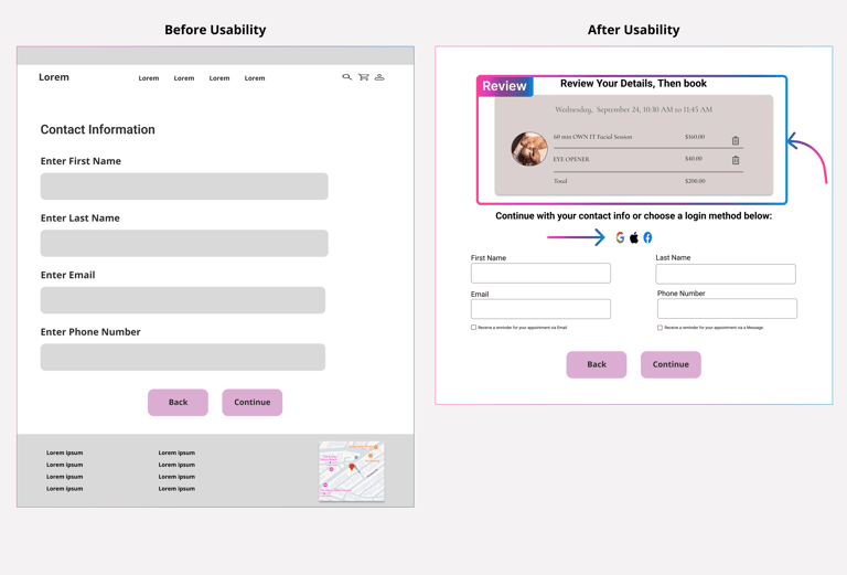
refined our UX writing to make the content clearer and more user-friendly.
redesigned the entire page to simplify the experience.
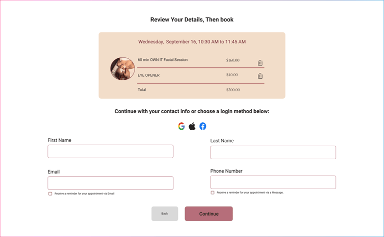
Added a service summary box at the top for users to review their selected services.
Introduced Google and Apple ID login options for easier access.
( Phase 1)
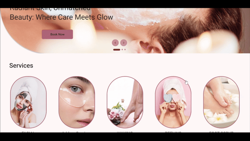
HOME PAGE
FACIAL SERVICES
DETAILS & TIME
User Flow
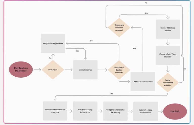
I designed a simple and intuitive user flow to help visitors explore services and book a facial appointment in just a few steps. The experience reflects the brand’s calming, self-care tone while supporting mobile-first usability.
Users start from Homepage or Landing page
Browse services → view details → book appointment
Based on user insights: clarity, trust, and ease were top priorities
Deliver
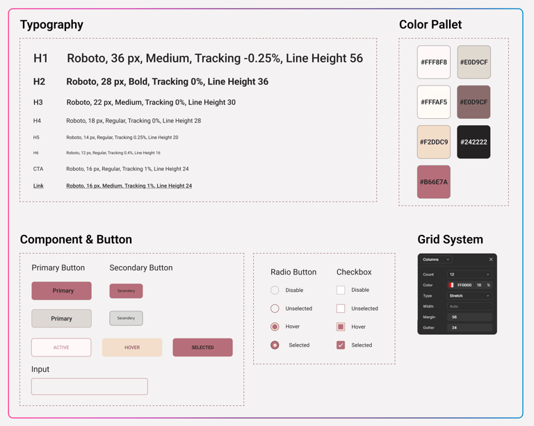
UI Kit
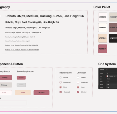
This UI Kit was created to keep the designs consistent and clean. It includes all the core elements — from typography and colors to buttons and icons — and it helped ensure organization and speed throughout the design process.
Usability Testing & Iteration
( Phase 2 )
High Fidelity Prototype
UI Kit applied and content finalized
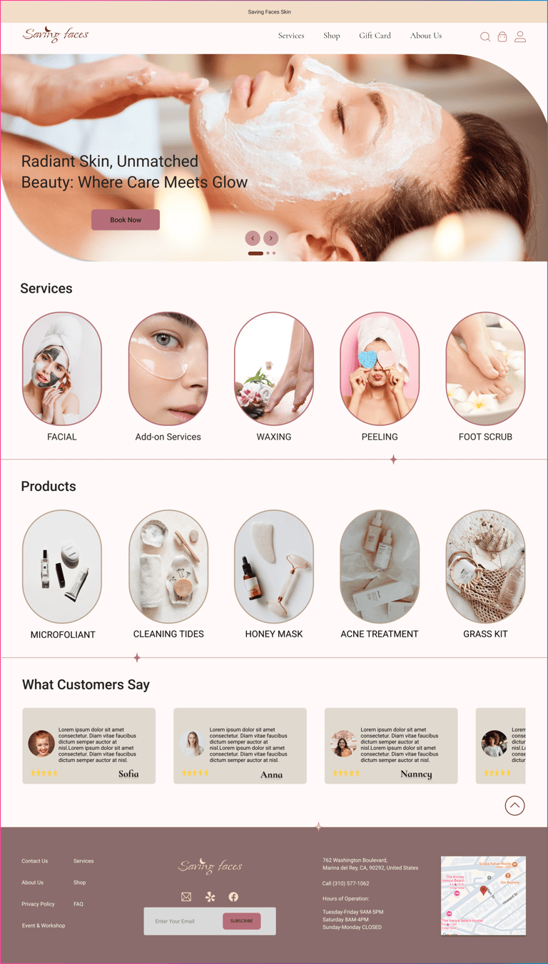
Home Page
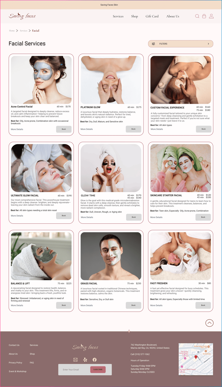
Facial Services
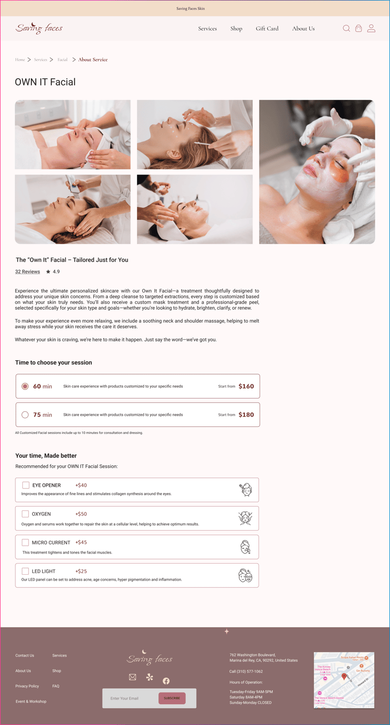
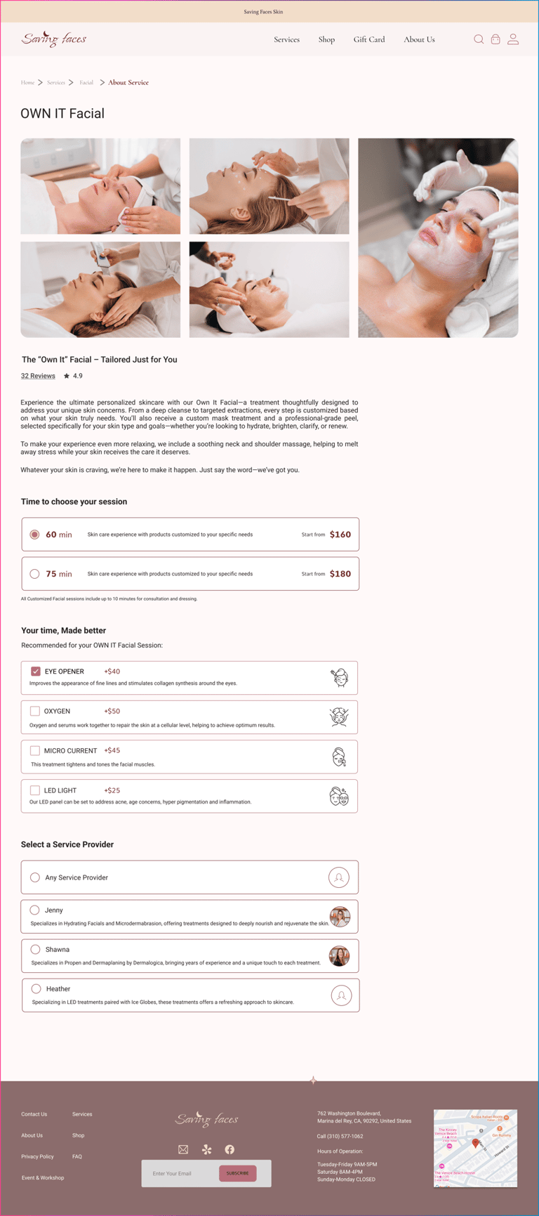
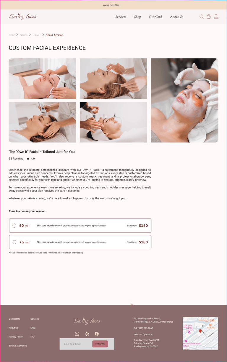
Services Details
Login & Personal Information
High Fidelity Prototype
Reflection
What This Project Taught me:
Through usability testing, I discovered how small user behaviors and feedback can reveal deeper issues and lead to impactful design decisions.
This experience also strengthened my ability to confidently gather and apply feedback from users and teammates. I learned that iteration is not just part of the process—it’s essential for creating thoughtful, user-centered solutions.